Color is a significant focus for us, whether discussing interior or exterior paint choices or selecting the perfect accents to complete your look. It surrounds us in our everyday lives, influencing our mood and perception of spaces. Yet, discussing color can sometimes be challenging due to its complexity and subjective nature. That’s why we aim to provide you with insights into the basics of color language to empower your design conversations. By understanding fundamental color concepts, you can confidently navigate the world of color and make informed choices for your home.
Primary colors
The primary colors—red, blue, and yellow—are the foundation of all other colors in the spectrum. Through blending these primary colors together, a vast array of secondary and tertiary colors can be created. This process of mixing primary colors enables the creation of a diverse range of hues and shades, offering endless possibilities for artistic expression. By understanding the principles of color mixing and the relationships between primary, secondary, and tertiary colors, artists and designers can unlock the full potential of the color spectrum. Experimenting with different combinations of primary colors allows for the creation of unique and captivating color palettes tailored to specific purposes and preferences.
 Color Wheel
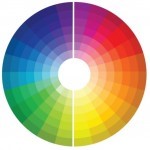
A color wheel is a visual representation of these color relationships, typically presented as a circular diagram. It provides a convenient way to understand how colors interact and complement each other. Color wheels range from simple versions, displaying primary colors and their basic blends like red, orange, yellow, green, blue, and purple, to more complex ones, which showcase a broader spectrum of hues and variations in lightness.
 Warm Colors
Warm colors, found on the right half of the color wheel, include reds, yellows, and oranges. These hues evoke feelings of warmth, energy, and vibrancy. When incorporating warm colors into your space, consider the desired atmosphere and energy level. Warm colors are often described as “advancing” because they appear closer to the viewer, creating a sense of intimacy and coziness. As a result, they can make a space feel more inviting and slightly smaller, perfect for creating intimate settings or adding character to larger rooms.
 Cool Colors
Cool colors, located on the left half of the color wheel, encompass blues, greens, and purples. These hues are often associated with tranquility, relaxation, and a sense of spaciousness. Cool colors have a “receding” effect, making them ideal for creating a calming ambiance in interior spaces. By using cool tones, you can visually expand a room and evoke a serene atmosphere. These colors are commonly utilized in living spaces and bedrooms to promote relaxation and enhance comfort. Incorporating cool colors into your home décor can help achieve a soothing environment that encourages rest and rejuvenation.
 Complimentary Colors
Color wheels serve as valuable aids in selecting harmonious color combinations. Complementary colors, a key feature of color wheels, offer an effortless way to find pairs that complement each other while providing visual interest. By identifying colors located opposite each other on the color wheel, you can discover complementary pairs that create dynamic contrasts. These color combinations, although strikingly different, harmonize well together, adding vibrancy and balance to your design scheme. Harnessing the power of complementary colors allows you to infuse your space with energy and excitement. So, the next time you’re looking to create a bold statement or add a pop of color, consider exploring the world of complementary colors for a visually captivating result.
 Monochromatic Colors
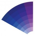
The monochromatic color scheme has gained popularity for its simplicity and versatility in interior design. This approach relies on variations in lightness and darkness within the same color family to create visual interest. By utilizing different shades and tones of a single color, a monochromatic palette can achieve a cohesive and harmonious look throughout a space. Additionally, the resurgence of monochromatic looks emphasizes the use of different sheens or finishes to enhance texture and depth, rather than solely relying on hue variation. This trend allows for creative expression while maintaining a unified aesthetic. Embracing a monochromatic scheme offers a sophisticated and modern design solution that can be tailored to fit any style or space.
 Analogous Colors
If the stark contrast of complementary colors isn’t your preference, you might find analogous colors more appealing. Analogous colors are those that sit next to each other on the color wheel, creating a more harmonious and cohesive look. By selecting hues from neighboring sections of the color wheel, you can achieve a softer and more subtle color palette. Whether you’re drawn to warm or cool tones, exploring analogous options allows for greater flexibility and customization in your color scheme.
If you have any other color-related terms or concepts that you find confusing or overwhelming, feel free to reach out to us. We’re here to provide clarity and guidance to make your color decisions easier.


No comment