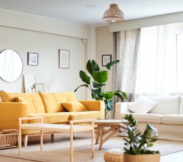
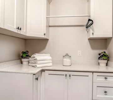
Choosing the perfect color scheme for your home can often feel daunting and is fraught with potential regrets. What if the color that looked perfect on a swatch doesn’t translate well on the wall? Or what if the color scheme you loved initially starts to wear on you after a while? These are common concerns that many face when deciding on the aesthetics of their home environments. It’s understandable to feel overwhelmed by the multitude of options and the fear of making a choice that you may later regret. However, there are strategies and considerations that can help alleviate these worries and guide you towards selecting a color scheme that you’ll love for years to come.
Reflect your Personality
It’s crucial that your home not only reflects your personality but does so in a way that highlights the more refined aspects of your character. In my approach, I focus on encapsulating the sophisticated and subtle traits, steering clear of anything that might seem scatterbrained or flighty. Selecting the right colors and décor is a powerful method for drawing out these qualities. When choosing colors for a client, I rely heavily on my intuition and years of experience, often finding that certain shades just naturally “pop” and fit perfectly with a specific space. This process also includes ensuring that all elements blend harmoniously, which is why I prefer using analogous colors. This approach helps create a seamless and aesthetically pleasing environment.
What is Analogous?
Analogous colors refer to colors that are next to each other on the color wheel. These are hues that share a common base and are visually similar, creating a smooth transition from one color to the next. This method helps in maintaining a cohesive look throughout your home. For those who aren’t trained in color theory, choosing analogous colors can prevent the décor from clashing and looking disjointed. It’s a safer bet for achieving an aesthetically pleasing ambiance without needing a deep understanding of complex color schemes.
Create an Impact with Comparable Colors
Utilizing analogous colors doesn’t mean your home will lack impact or interest. Small shifts in shade or tone can have a significant impact on the feel of a room. For instance, choosing a green for one room and a blue-green for an adjacent room can create a striking effect, while ensuring that the overall flow between rooms is smooth. This approach makes the spaces feel interconnected and part of a unified theme, rather than a series of disconnected styles.
When planning your home’s color scheme, aim to create a cohesive space where every room appears to be designed simultaneously and in the same style. Mixing different styles is certainly possible, but it’s crucial to maintain a consistent overarching theme throughout the home. This approach prevents a disjointed appearance where each room seems to reflect a different phase of your life or a varying style preference. Ensuring a unified theme helps each room flow seamlessly into the next, enhancing the overall harmony of your home.
Bringing it All Together
If you’re seeking inspiration or need a nudge to begin, consider inviting a color consultant into your home. I often bring my color wheel to client consultations. This tool helps select the right colors and also ignites creativity and excitement in the decorating process. Choosing the right theme for your home should be both enjoyable and inspiring. Let’s make it fun and ensure that the colors you choose today continue to delight you for years to come. With the guidance of a color consultant and the vibrant possibilities of the color wheel, we can transform your space into a personalized haven that reflects your unique style and preferences.
For additional tips, insights, and inspiration for your home painting projects, visit our website at sisupainting.com and our blog at sisupainting.com/blog.


No comment