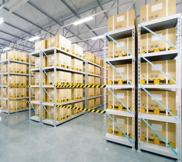
Choosing the right color scheme for a warehouse space is not just about aesthetics; it involves considering functionality, safety, and the psychological impact of colors. An effective color scheme can enhance the working environment, improve safety, and even boost productivity. The strategic use of color can streamline workflows and facilitate the quick identification of different zones and items. Additionally, color coding can align with international safety standards, promoting a universal understanding of the space’s layout. Introducing color-coded signage and labeling systems can further enhance efficiency and safety by providing clear visual cues for employees and visitors navigating the warehouse.
Functional Color Choices
In a warehouse, certain colors can serve functional purposes. For instance, bright colors like yellow or orange are often used for safety markings, as they are highly visible. Neutral colors like gray or beige are commonly used for walls and floors, as they help in reducing glare and eye strain. This choice is not only practical for day-to-day operations but also beneficial for long-term worker comfort and well-being. Implementing a color-coded system for storage areas can improve inventory management and retrieval efficiency, reducing operational costs and minimizing disruptions.
Safety and Navigation
Color plays a crucial role in safety and navigation within a warehouse. You can use different colors to delineate areas, mark pathways, and indicate hazard zones. This not only aids in navigation but also helps in maintaining safety standards. Clear color distinctions can act as non-verbal cues, guiding employees and visitors safely through different sections of the warehouse. Regular audits and assessments of the color-coded system can ensure its effectiveness and relevance as the warehouse layout evolves over time.
Psychological Impact
Colors have a psychological impact on workers. Cool colors like blue and green are known to create a calm and focused environment, which can be beneficial in a busy warehouse setting. On the other hand, warmer colors can energize and stimulate activity. It’s essential to use color psychology to foster an environment that supports the mental health and productivity of employees. Conducting surveys or focus groups to gauge employee responses to different color schemes can provide valuable insights for optimizing the working environment.
Balancing Aesthetics and Practicality
While practical considerations are paramount, it’s also important to create a visually appealing environment. A well-thought-out color scheme can make a warehouse more pleasant for employees, which can contribute to morale and productivity. Aesthetics, when balanced with practical needs, can result in a space that is both efficient and enjoyable to work in. Thoughtful use of color can also reflect the company’s brand and culture. Collaborating with interior designers or color consultants can help strike the right balance between aesthetics and functionality, ensuring a harmonious and inspiring workspace.
Considerations for Lighting
The lighting in a warehouse can significantly affect how colors look and perform. Consider the type of lighting used and how it interacts with the chosen colors, especially in areas where natural light is limited. Choosing the right lighting can enhance the effectiveness of color schemes and ensure the achievement of the intended atmosphere and functionality. Using reflective surfaces and strategically placing lights can maximize the benefits of the chosen color scheme. Investing in energy-efficient lighting solutions not only reduces operational costs but also enhances the overall sustainability of the warehouse environment.
Branding and Identity
For businesses, incorporating brand colors into the warehouse space can reinforce company identity and create a sense of unity. This can be done subtly through accents and highlights, without compromising the overall functionality of the space. Consistent use of brand colors can also strengthen brand recognition among employees and visitors. However, it’s important to ensure that the branding complements, rather than conflicts with, the color-coded safety and navigation elements. Conducting regular audits of the warehouse’s visual identity can ensure that branding elements remain prominent and consistent across the facility.
Final Thoughts
Selecting an effective color scheme for a warehouse requires a balance between functionality, safety, psychology, and aesthetics. The right choices can create a safe, productive, and pleasant working environment. Colors should be selected not only for their immediate visual impact but also for their long-term effects on operations and personnel. With the correct application, color schemes can significantly contribute to a seamless and efficient warehouse operation. Regular evaluations and updates to the color scheme can ensure its continued effectiveness in meeting evolving needs and industry standards. To discover more about color schemes for commercial spaces and professional painting services, visit our website at sisupainting.com and our blog at sisupainting.com/blog.


No comment